This portfolio page is way out of date; I've been too busy actually working to have the time to upgrade.
For now, please see my portfolios at the following links for a taste of the work I've been doing. Thanks!

http://steventon.deviantart.com/

http://happyglyphs.carbonmade.com/


John Steventon
Cartoonist
Illustrator

John@HappyGlyphs.com


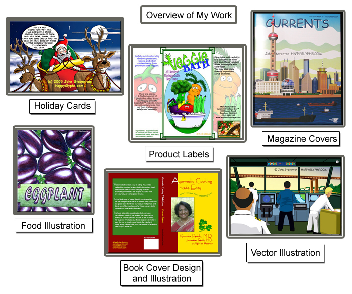
I am a professional Cartoonist and Illustrator available for freelance assignments. I have a range of styles and media that I work in, from cartooning to vector illustrations. I am also a writer and publisher, with a background in research and safety, making me quite capable of creating custom booklets and circulars on many subjects.
My work appears worldwide in books, magazines, newspapers, on posters, postcards, product labels, and numerous other print and digital media.

Initial contact by email only, please.
Thank you very much for your consideration, JOHN :0)


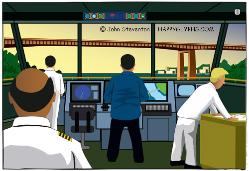
Recent Freelance Assignments:Illustrations for a presentation.


Illustration for an Annual Report
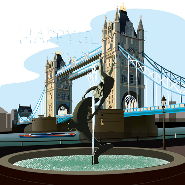
One of ten illustrations featuring Ports of the World.


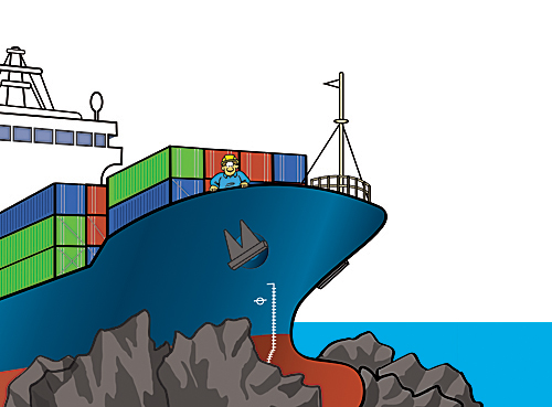
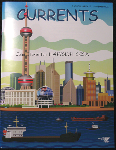
Recent Freelance Assignments: Vector Illustration for CURRENTS magazine


Comic Book cover Illustration

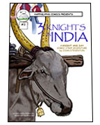
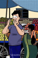
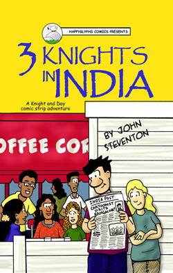
Digital Painting for a comic book cover3 Knights in India

Color Illustration for 3 Knights in India.

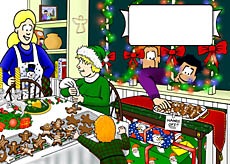
Interior illustration from my 2004 Holiday card .

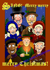
My 2003 Holiday card sent to Friends, Family, and Clients

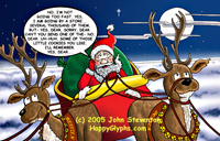
My 2005 Holiday card .


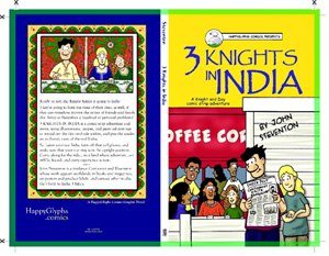
Graphic Novel Cover Illustration

Cover Layout for my Graphic Novel3 Knights in India

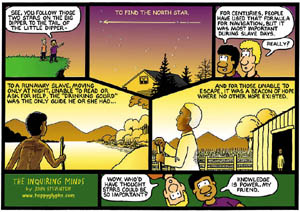
The Great Underground Railroad
This cartoon was published in "Passages to Freedom: The Underground
Railroad in History and Memory",
edited by D. Blight for Smithsonian Press.

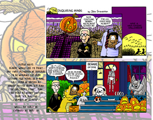
Sample page from my 2003 calendar. My idea was to design a graphically interesting calendar beyond just showing the cartoons alone.


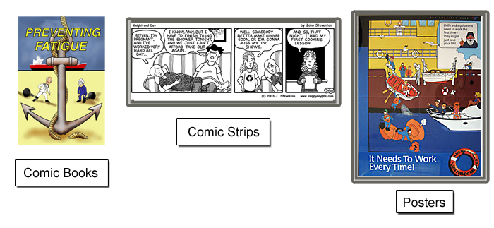
Current Freelance Assignment: A long term position that has continued for several years now, involving comic book style Safety Manuals, Safety Posters,logos, illustrations, book and magazine covers.

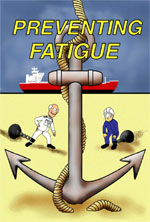
Preventing Fatigue

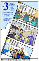
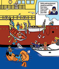
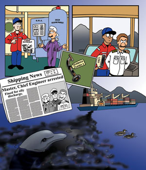
This first job involved the creation of an easy to read, attractive and humorous comic book style pamphlet designed to entertain while educating.

The client and I discussed the elements needed to be covered, and I arranged them first into an outline, and then into individual pages. Humorous cartoons and illustrations were then created to work with the accompanying text, and then interesting layouts were created for each page.

For this book, Preventing Fatigue, I created 24 pages, a spot illustration, and a cover. More books are planned in this series. These books will be given to seafarers and others in the shipping industry around the world, with the intent to improve safety and awareness in the industry. This book is currently being translated into other languages to meet the needs of the international shipping industry.


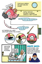
Shipboard Safety

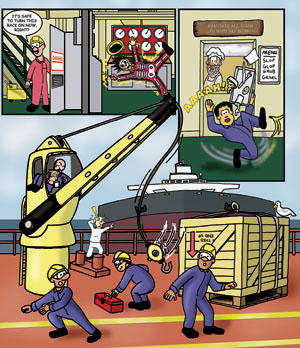
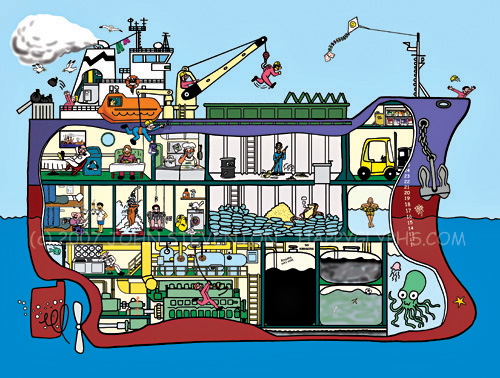
For this second book, Shipboard safety, I created 18 pages, 1 spot illustration, and a cover. I brought my previous experience as a Safety Officer in research and development to this project, as well as an understanding of the Maritime Shipping industry I developed while working on the first book. Together with my client, we produced this book aimed at general safety awareness with a special regard to the unique hazards of searfaring life.


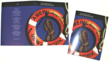
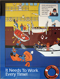
Here are two of the eight posters created for the Loss Prevention program, expanding on the characters and themes created for the above books. The first is shown as the complete poster, using a design and logo inspired by the folder cover illustration below.


Recent Freelance Assignment: Massive Safety Poster

More from this series soon, and more from the series of posters, as they become published.


Freelance: This digital painting was my original concept for the Shipboard Safety cover mentioned above. The client liked it very much, and decided that it would serve them better as the cover for their overall Loss Prevention Folder.

Later, I was asked to take this concept and create a logo for the company's Loss Prevention program.


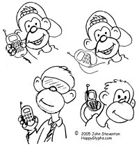
Freelance Assignment: Create a character and logo for a new company. The client asked for a 'hip monkey with a cell phone', so I presented them with some sketches, and then a finalized version based on what they liked. The logo was then created, and then a separate animated gif (not shown) that the client requested.


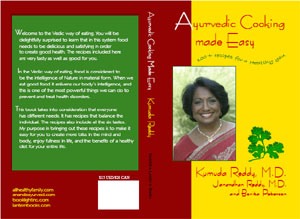
Freelance Assignment: primarily involving the design of a cookbook cover. The client provided the photo and text, and asked for a cover that would stand out from the crowd. The client and author wanted something using the rich colors, textures, and flavors of Indian culture. Because the rectangular photo needeed to be on the front cover, I designed the cover on a rectangular grid. To break up the static geometry, and add interest to the design, I added the sprig of cilantro ( that I illustrated ) and placed the subtext on a wavy line.

A suitable collection of fonts was chosen, to reflect the feel of the cover, and the rest of the design was left elegantly simple.


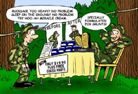
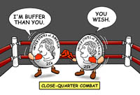
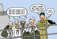
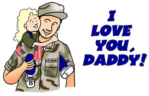
A freelance assignment involving the illustration and design of postcards aimed at military personnel and their families. The client provided the idea and text, and we then worked together to create the final design which I illustrated and prepared for print on 4x6 inch postcards. 20 unique cards have been created to date.


To see more of this series, CLICK HERE


Please click on an image to enlarge.


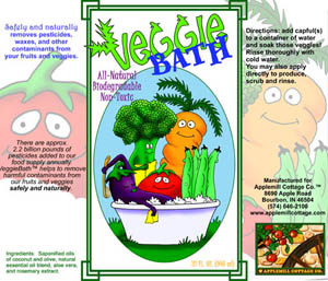
This client needed a vibrant, humorous, and very eye-catching illustration for a product label. After my initial sketches, the client decided that she wanted minimum background, so that total focus would be on the veggies.
I was later asked to design the label itself, which I decided to turn into two separate front and back labels. I modified some of the letters of a suitable font to look like vegetables to complete the product logo.
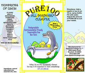
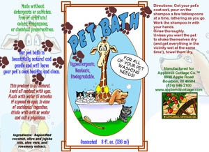
This label is the first in a series. The second label was created as one label, so the first label was later redesigned as a single label. I am currently designing and illustrating additional labels in this series, each with a unique look of its own, yet all tied together with unifying elements. All material here is (c) Applemill Cottage Co.


The above client had in mind for some time a logo to represent her company overall. We discussed what she was looking for, and what I could do for her, and after a series of sketches arrivede at the logo below. First the illustration was done in colored-pencil, and then the rest of the logo was created digitally. Overall, the look w were going for was a strong, stable company with traditional values. All material here is (c) Applemill Cottage Co.


This client wanted a humorous interface for a website, with vivid colors to make it stand out from competitors. The interface and accompanying items would be converted to an interactive Flash page.

The client decided on a desktop with monitor, car keys, cell phone, etc, and a view of ‘Real Estate’ outside of a window. Some of these items were drawn in different poses for the purposes of animation.


Click here to see details from this project.


Please click on an image to enlarge.


A freelance assignment which involved creating a unique and eye-catching logo for a church fundraising event. The client supplied photos of the event, and communicated the elements they wished to see incorporated into the design. The coloring of the design needed to be simple to accomodate screen printing, and the logo will be used for t-shirts, bbq aprons, flyers, and newspaper ads.

The text has been edited to remove proprietary information.


Some examples from another freelance assignment. The client wished to create a corporate flyer that graphically demonstrates how their product works. They wanted a simple yet communicative series of illustrations. Brainstorming via phone and email, I created a series of sketches which led to color cartoons that fit their needs.

Some text and proprietary information has been edited from the following illustrations.


That campaign worked so well, that I was hired to develop a follow-up series of cartoons, demonstrating how their product can work in a different market.

Click here to see more of this project.


Please click on an image to enlarge.


Food Illustration; combining my love of cooking with an artist's appreciation for the beauty of nature.

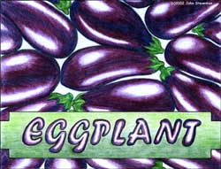
Eggplant : A package cover demonstrating more traditional illustration which I created for a design class.

Cilantro and Mango: created to embellish some recipes I am preparing for a book.


New Canaan Publishing gave me free reign to design and illustrate this journal for kids whose parents are overseas in the military. The illustrations were designed to be colored by the children, so I created an open style with minimum shading. The layouts allowed the illustrations to fill the page, and I chose a childlike hand font to go with the illusion that the child has written the book.
All material is (c) 2003 New Canaan Publishing, Inc.


Click here to see more of this project.


The Comic Strips, characters, and original artwork, writing, and designs, including Knight and Day, 3 Knights in India, Oz, and The Inquiring Minds on this site are ©2000-2010 by John W. Steventon. All rights reserved.